In the sea of mobile applications, your app icon serves as the first point of contact with potential users.
This crucial visual element can mean the difference between an app that catches attention and one that gets lost in the endless scroll of the App Store.
Creating an icon that stands out while maintaining professional appeal requires careful consideration of multiple design elements and principles.
The Psychology of First Impressions
App icons have mere seconds to make an impression on potential users.
Research indicates that users spend an average of three seconds scanning each app listing, with the icon being the first element they notice.
This brief window of opportunity means your icon must immediately convey your app's purpose, quality, and value proposition while standing out among millions of other applications.
Essential Design Principles for App Icons
Simplicity and Recognition
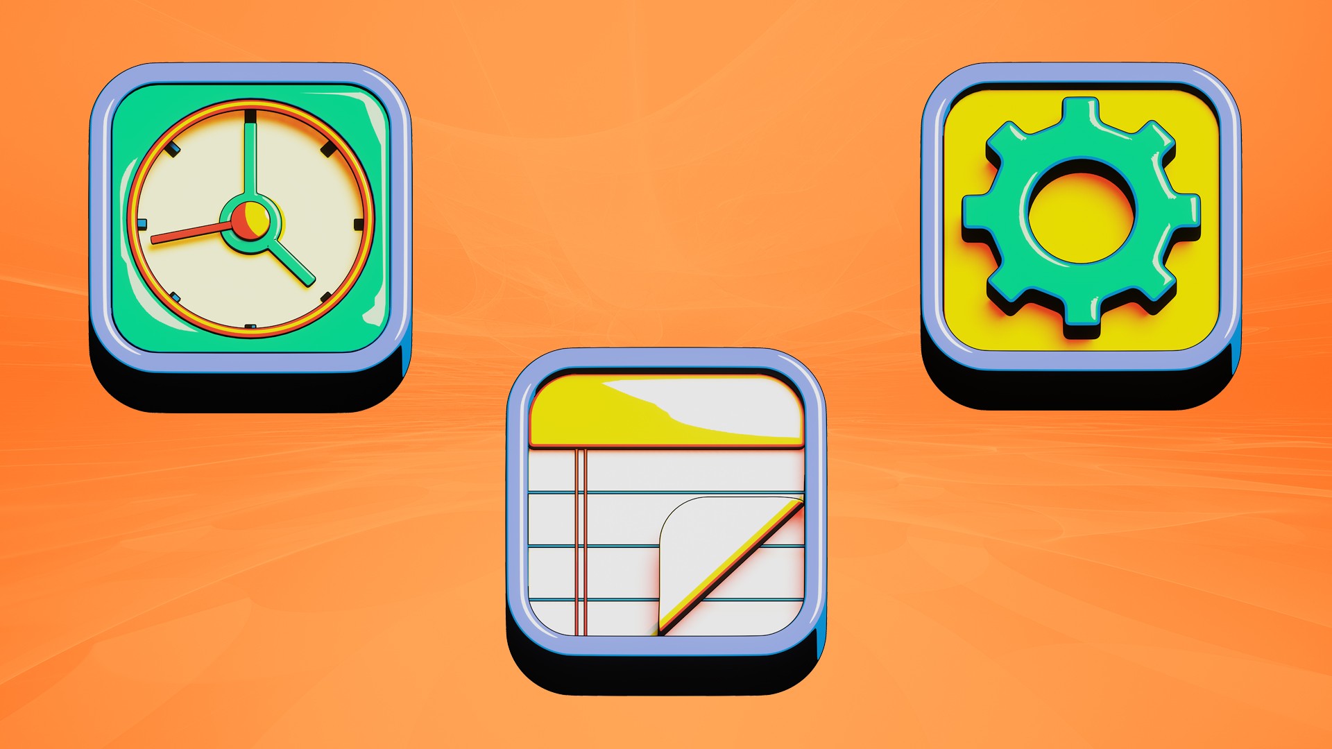
The most successful app icons embrace simplicity while maintaining distinctiveness.
Consider Instagram's evolution from a detailed vintage camera to its current simplified gradient design. This transformation maintained the app's recognition factor while creating a more versatile and memorable icon.
Simple designs render well across different sizes and contexts, from the tiny spots on a user's home screen to larger feature placements in the App Store.
Color Psychology and Brand Identity
Color choice plays a fundamental role in icon design, influencing both visibility and emotional response.
WhatsApp's use of green conveys growth and communication, while Netflix's bold red signals entertainment and excitement.
When selecting colors, consider both the psychological implications and practical visibility concerns.
Your chosen palette should work harmoniously with your brand identity while ensuring the icon remains visible against both light and dark backgrounds.
Technical Considerations
Size Adaptability
Modern app icons must maintain their visual integrity across a wide range of sizes, from the smallest 29×29 pixel spot on an Apple Watch to the largest 1024×1024 pixel marketing asset.
This scalability requirement demands careful attention to detail and thorough testing across different devices and contexts.
Designers should ensure that key visual elements remain recognizable even at the smallest sizes, avoiding intricate details that might become muddy or illegible when scaled down.
Platform-Specific Guidelines
Apple's App Store and Google Play Store maintain different design guidelines and technical requirements for app icons.
Apple's guidelines emphasize depth and dimensionality through subtle gradients and lighting effects, while Google's Material Design principles focus on bold, flat designs with strategic use of shadows and layers.
Understanding and adhering to these platform-specific requirements ensures your icon appears professional and native to each environment.
Current Trends in App Icon Design
Minimalist Evolution
Contemporary app icon design has embraced minimalism without sacrificing character.
Microsoft's Fluent Design System exemplifies this trend, using simple geometric shapes and subtle gradients to create distinctive yet elegant icons.
This approach focuses on core visual elements that communicate the app's function while maintaining a modern, sophisticated appearance.
Gradient Renaissance
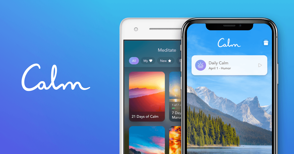
Gradients have made a sophisticated comeback in icon design, moving beyond simple linear transitions to more complex color interactions.
Apps like Calm and Asana use subtle gradient effects to create depth and visual interest while maintaining clarity and recognition.
Modern gradient implementation focuses on natural color progression and meaningful color choices that enhance the icon's message.
Standing Out in Different Categories
Gaming Apps
Gaming app icons require a delicate balance between excitement and professionalism.
Successful gaming icons often feature character art or recognizable gameplay elements while maintaining clarity at small sizes.
Clash of Clans and Among Us demonstrate effective use of character-based icons that remain instantly recognizable while conveying the game's personality.
Productivity Apps
Productivity app icons tend toward more abstract, geometric designs that suggest efficiency and organization.
Applications like Notion and Todoist use simple, bold shapes with careful color choices to stand out while maintaining a professional appearance.
These icons often incorporate subtle visual metaphors that relate to the app's core functionality.
Testing and Iteration
User Testing Importance
Effective icon design requires extensive testing with target users.
A/B testing different icon versions can reveal surprising insights about user preferences and recognition rates.
A tool like SplitMetrics allows developers to test multiple icon variations before final publication, providing valuable data about which designs resonate most strongly with target audiences.
Context Testing
Icons should be tested in various contexts, including different devices, backgrounds, and alongside competitor apps.
This comprehensive testing helps ensure your icon maintains its impact and legibility across all potential viewing scenarios. Consider how your icon appears in search results, featured sections, and on user home screens.
Common Pitfalls to Avoid
Overcrowding is perhaps the most common mistake in app icon design.
Attempting to include too many elements or concepts in a single icon often results in a cluttered, confusing design that fails to communicate effectively.
Similarly, overreliance on text within icons can lead to legibility issues at smaller sizes and across different languages.
Another frequent error is failing to consider the icon's appearance in different contexts. An icon that looks striking in isolation may lose its impact when placed alongside other apps or against varying background colors.
Testing your icon in multiple realistic scenarios helps avoid these issues.
Future Trends and Considerations
The future of app icon design continues to evolve with technological advances and changing user preferences.
Adaptive icons that respond to system-wide theme changes and dynamic icons that update based on app status or user interaction represent exciting opportunities for innovative design approaches.
However, these advanced features should be implemented thoughtfully, ensuring they enhance rather than detract from the icon's core purpose.
Conclusion
Creating an outstanding app icon requires careful consideration of design principles, technical requirements, and user psychology.
Success lies in finding the perfect balance between standout visibility and professional appeal, while maintaining consistency with your brand identity and app functionality.
Regular testing and iteration, combined with attention to platform-specific guidelines and current design trends, will help ensure your icon effectively captures user attention in today's competitive app marketplace.
Remember that your app icon is not just a design element but a crucial marketing asset that can significantly impact your app's success.
Investing time and resources in creating and testing the perfect icon can yield substantial returns in terms of user acquisition and brand recognition.
As the app marketplace continues to evolve, maintaining awareness of emerging trends and user preferences while staying true to fundamental design principles will help ensure your app icon remains effective and compelling.